Case Study
Designing for Clarity, Trust, and Scale in Complex Financial Tools
Overview
Led foundation design, Figma library creation, documentation, and adoption strategy across design and engineering.
Client
Clifton Larson Allen (CLA)
Role
UX Lead for Design System, Contractor
Timeline
6 months
Tools
Figma, Material UI (MUI) React Library, Storybook, Loop
Challenge
CLA products support financial reporting, tax workflows, and advisory tools, where clarity and trust are critical. Their product ecosystem had grown organically over time through outsourced work and acquisitions. A previous design system (Seamless 1.0) was left unfinished and unadopted due to a lack of governance and clear ownership.
As a result:
Products lacked consistency
Designers worked in silos without shared standards
Developers built one-off solutions with little reuse
Product teams amassed a backlog of technical debt and accessibility violations
AI-assisted workflows failed to produce reliable results
The organization hired me to assist with their transition to in-house UX, adoption of AI-assisted workflows, and modernization of legacy products. I would build Seamless 2.0 to align design teams and development teams around a single vision for the future of CLA.
Goals
Create a single system that integrates the CLA Brand, Material UI, and Accessibility requirements while supporting phased adoption by complex legacy applications.
Improve organizational design maturity by establishing shared processes, governance, and cross-team collaboration.
Accelerate adoption of AI-assisted workflows through strong foundations and thorough documentation.
Scope
Establish foundational systems
Build and maintain Figma libraries
Create all training and documentation
Roll out adoption strategy across design and engineering
Constraints
All foundational systems must be approved by CLA’s 3rd party Marketing team
Product roadmaps do not allow dedicated time for design system adoption
Design System resources were limited to 1 designer (me) and 1 developer
Approach
Balancing standardization, flexibility, and adoption across teams with a phased approach
Teams had varying levels of design maturity, from relying on legacy patterns to actively pushing for modernization, alongside conflicting expectations around preserving vs. evolving UIs. To address this, I focused on meeting teams where they were, leveraging Material UI for consistency and speed, and balancing standardization with autonomy.
I established a 4-phase strategy that would allow me to move forward quickly while building buy-in from designers, developers, and leadership.
Designing for Financial Systems
Designing financial products brings special challenges: high stakes, dense data, strict rules, and the need for speed. Users handle complex filings, large datasets, and frequent client switches.
Clarity over density. I used Material UI themes and data tables to improve visual hierarchy, legibility, and flexible layouts so users can scan and act quickly.
Reduce cognitive load. Financial workflows often use multi-column forms, dense inputs, and frequent context changes. Seamless 2.0 favors predictable patterns, clear structure, and sensible defaults to lower effort and speed up work.
Phase 1: Align
Audit Products and Identify Shared Needs
This phase established a clear baseline and aligned teams around what the system needed to support. I began by familiarizing myself with the various teams and products, then dove deep into the auditing process.
Met with designers and engineers to understand workflows, constraints, and expectations
Reviewed existing screens, Storybook components, and Seamless 1.0
Identified shared patterns, inconsistencies, and gaps across tools
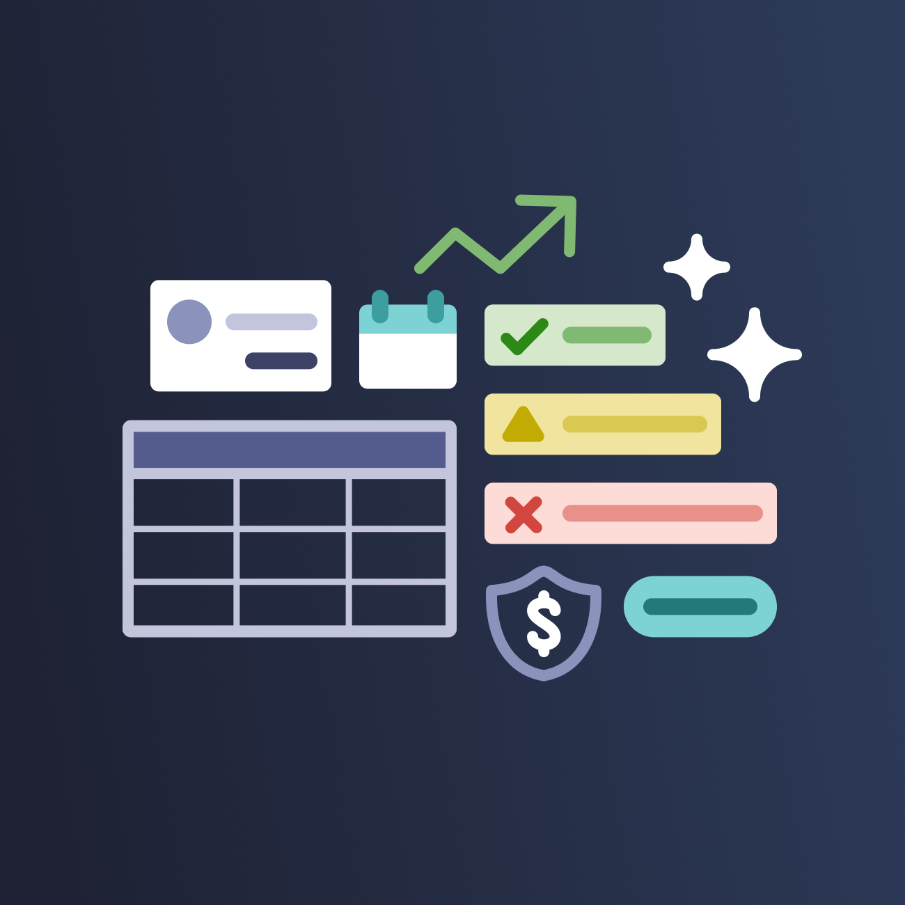
Audit Artifacts
Key Insights
Interfaces relied heavily on tables, even in cases where the data did not require a tabular format, limiting flexibility and readability
Typography skewed very small, despite user groups containing large numbers of older adults who face a higher prevalence of age-related vision changes
The initial color palette was too limited, leading designers to rely on hardcoded values, particularly medium-dark grays, to meet UI needs
Developers were matching code to outdated design patterns from Seamless 1.0, overriding instead of leveraging Material UI’s built-in functionality
Phase 2: Build
Create foundations and components from real UI patterns
Foundational Systems
Using insights from the audit, I created foundational systems and components grounded in real product needs. These foundations married the CLA brand guidelines (and vision for the future) with Material design’s token architecture.
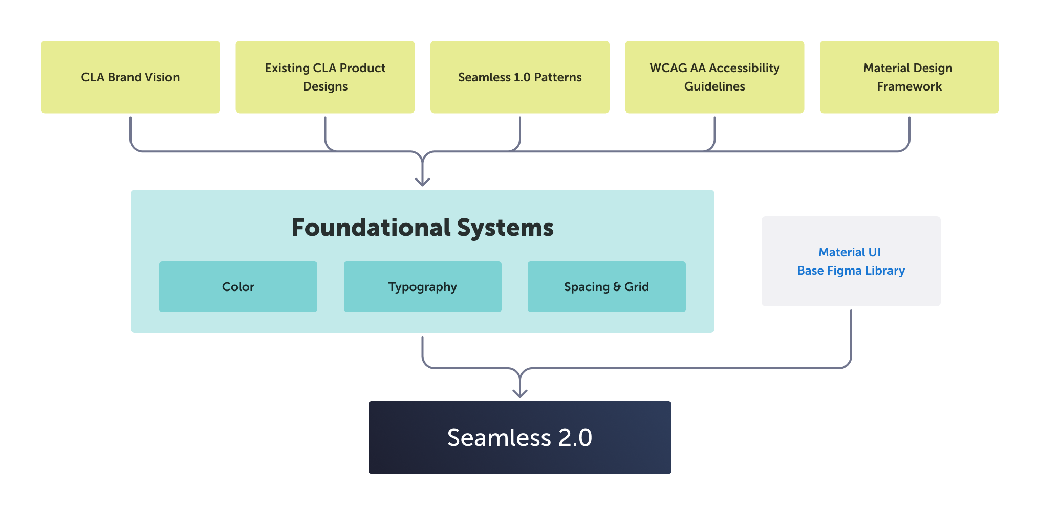
Color System
The new color system is an accessible, token-based system aligned to CLA’s brand and Material UI. It expands on existing Seamless 1.0 colors to support complex component and UI design needs. I deviated from MUI’s typical theming conventions to support both brand parity and clear visual hierarchy.
Typography System
I created a scalable type hierarchy optimized for readability, while still supporting complex data-dense UIs. One challenge was our core font Museo Sans does not have a Regular weight, so I established rules for using Light vs Semibold weights instead.
Spacing & Grid System
I established an 8px system to ensure visual consistency across components and layouts. I helped standardize screen size delivery, and defined layout grids and responsive screen behavior to support a range of devices and accessible scaling.
These sizing values and breakpoints are baked into the system as shared variables and align with development implementation
Supporting Libraries
Along with the Seamless core component library, I created additional supporting libraries. These are essential to streamline design delivery across products. They remain separate libraries because they have their own structures, publishing schedules, and levels of developer involvement.
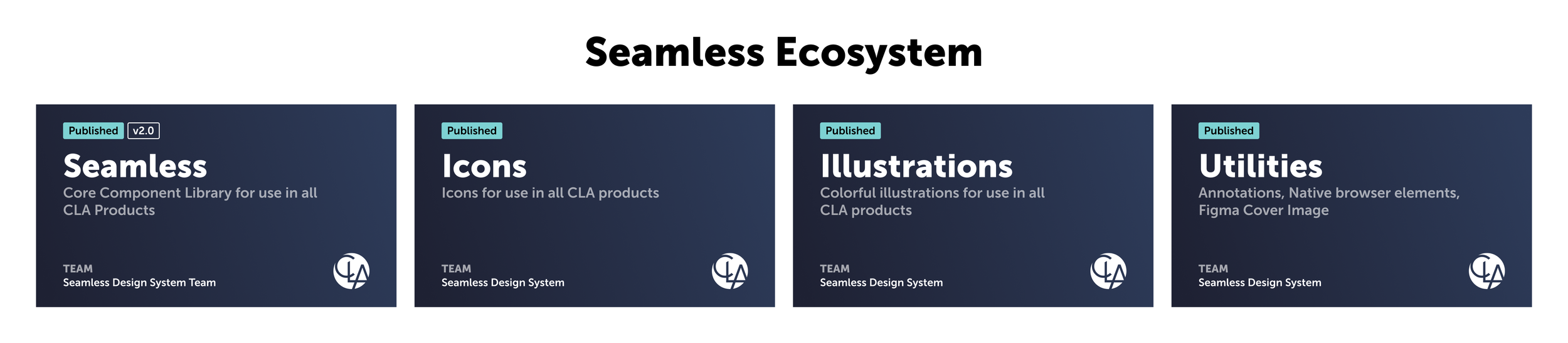
Icon Library
The Seamless icon library is a curated collection of Material icons with limited custom icons to ensure clarity and consistency. Included is icon usage guidelines and a process for requesting additional icons.
Illustration Library
The illustration library contains standardized line art with defined sizing, scaling, line weight, and accessible color usage. This ensures consistent asset usage across UIs, while reducing redundant asset creation. Assets can also be easily swapped if brand guidelines change. Similar libraries can be created for other types of imagery.
Utilities Library
Utilities are shared components that aren’t part of the code library, but are still critical for consistent design delivery. This includes native browser elements, a flexible annotation system, and a cover image that appears as a thumbnail within Figma’s file manager.
Phase 3: Validate
Test with real screens and pilot adoption
Component Approval
I reviewed each component against code, accessibility, and brand standards to ensure a unified system. Through weekly sessions, I aligned designers on usage, gathered feedback, and reinforced shared processes to improve design maturity.
I embedded resources and documentation directly into the Figma library including links, recordings, and component examples based on real UI needs.
Testing with Real Screens
I rebuilt key product screens to validate the system in real workflows. I provided both “quick swap” and aspirational design options. These before-and-after comparisons helped teams quickly understand value and align on a shared vision.
Initial Code Release
I partnered closely with our Seamless engineer to launch the first coded version of Seamless 2.0. We used Storybook, a tool that documents UI components as interactive, reusable code examples.
While the Figma library remained the source of truth for design, Storybook served as its code counterpart. Together, we maintained tight alignment between design and development, ensuring components matched across both systems.
Pilot Adoption
I worked closely with a product team to implement Seamless in a live application, reducing design effort and accelerating delivery through reusable components. This pilot demonstrated immediate value and generated feedback to strengthen the system for broader adoption.
Phase 4: Scale (planned)
Drive adoption, governance, and long-term sustainability
System Governance & Maintenance
I defined a governance model in close collaboration with engineering to ensure the system could scale and evolve. This included release cycles, a shared development backlog, design QA practices, and clear processes for component requests, variants, and code contributions.
Adoption Pathway
I established a flexible adoption model to support teams at different stages of maturity. This approach enabled partial adoption in legacy products, dev-driven refactoring using shared components, and full adoption in new applications or redesigns.
AI-Assisted Workflow Support
I outlined steps to support AI-assisted design and development by creating consistent, well-structured components and documentation. These foundations reduce ambiguity, improve output reliability, and enable AI tools to generate more accurate and scalable solutions.
Outcome
Seamless shifted how teams design and build at CLA. What started as foundational work became a shared system that reduces friction, improves quality, and enables teams to move faster with confidence. It established the structure needed to scale design consistently across complex financial tools while supporting both autonomy and collaboration.
A Single Source of Truth
Seamless unified design and development around a shared system. Foundations and components created a consistent standard across products and became the central point of connection between teams. This marked a clear step toward a more mature, system-driven organization.
Faster Execution. Higher Quality.
Pre-configured components and embedded foundations removed guesswork and reduced rework. Teams moved faster. Implementation became more accurate. Accessibility and responsiveness were built in, improving clarity across data-heavy workflows.
Built for Autonomy and Collaboration
Seamless enables teams to produce consistent, high-quality work without heavy oversight. Designers and developers operate with shared patterns, tools, and language. This balance of autonomy and alignment allows the system to scale with the organization.