Case Study
Launching the LUMA System to Scale an EdTech Startup

Overview
I co-designed and implemented the LUMA Design System for use in an education platform, mentor and student dashboards, marketing website, help center, and blog.
Client
Designlab
Role
UX Engineer - Front End Developer and UX Lead
Timeline
1 month Preliminary Research. 5 months
Initial Implementation
Tools
Figma, Sketch, HTML5, CSS3, Sass, JavaScript, JQuery, ReactJS, Django, Python
Challenge
“Make it the same, but much better”
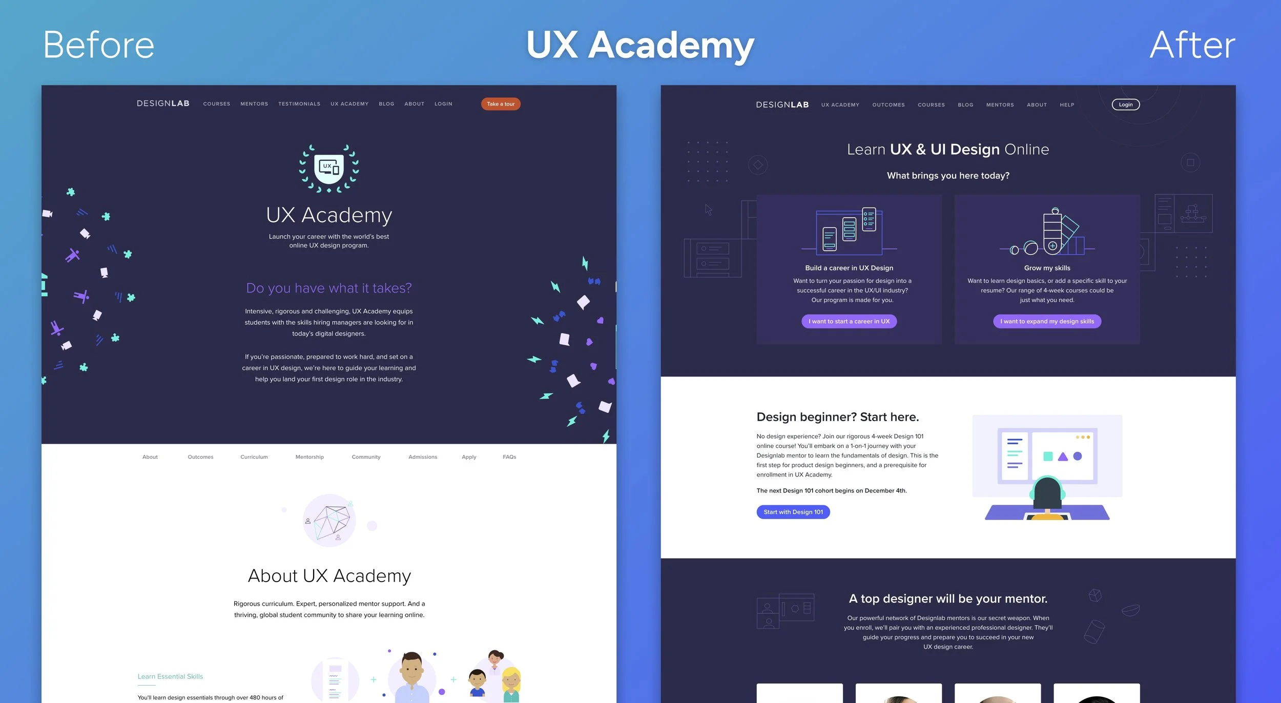
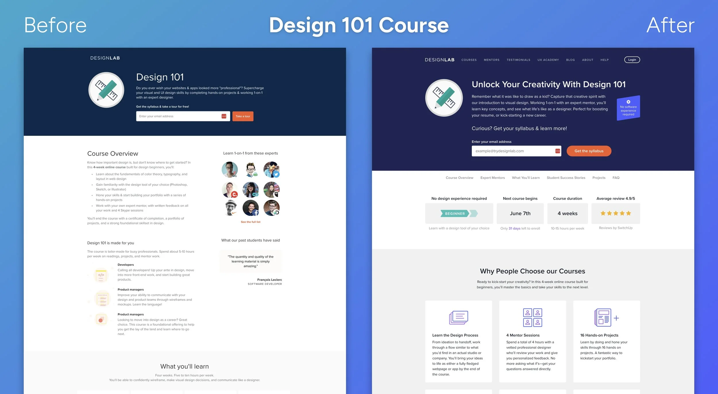
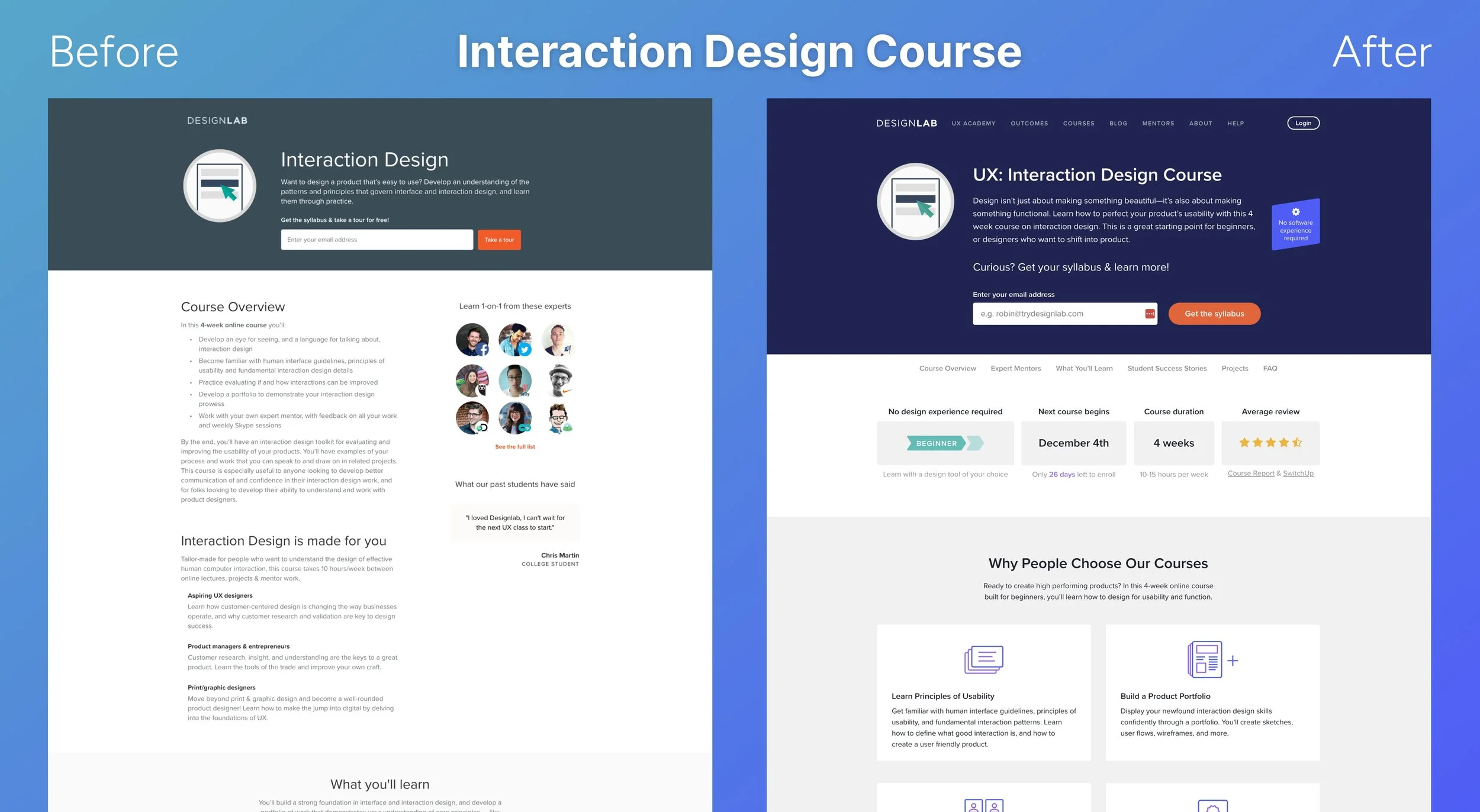
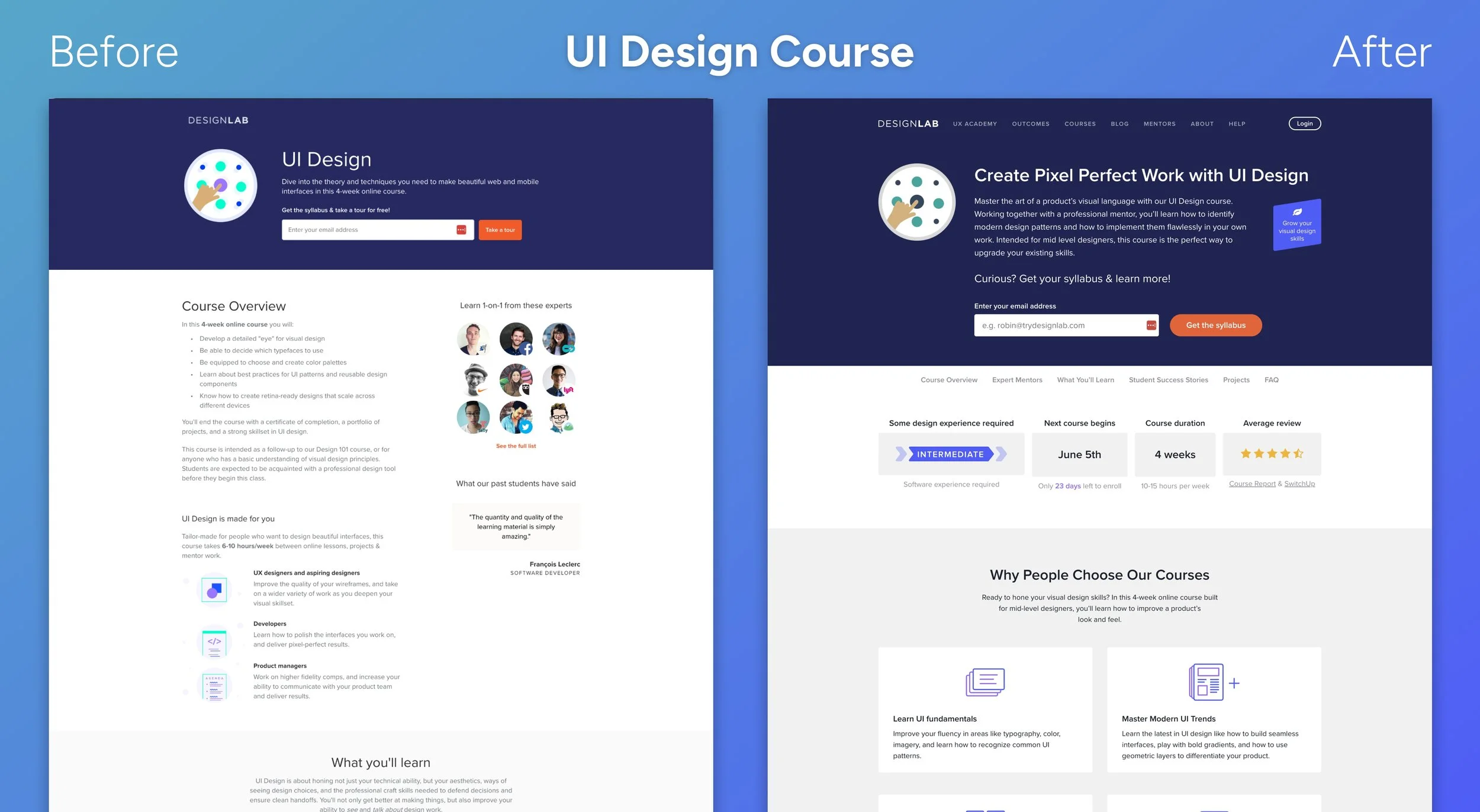
When I was hired, Designlab was a small, early-stage startup establishing itself as a leader in mentor-lead online design education. They were ready to launch into their next phase of rapid-growth with the goal to attract top-tier mentors and students. They needed their site to support lead-generation and reflect their expertise in Design and User Experience, but they did not have the design resources or need for a full redesign.
Their website was built piecewise as the company was establishing their brand direction, and while there were throughlines in the visual design, the lack of consistency was impacting the polish and usability. Each page contained a slightly different set of styles, colors, typography, and markup. Disorganized code was creating a maintenance nightmare as each page was made up of competing styles and fixing one issue could easily break something else.
Goals
Establish consistent branding and UI elements throughout the marketing site
Support a broader audience by making the marketing website fully responsive and incorporating accessibility best practices
Create a strong foundation that can expand to all digital products and support the company’s rapid growth
Scope
Conduct audit of existing UI elements and patterns
Research CSS Methodologies, Web Accessibility, and Design System Best Practices
Full refactor of the Marketing Website (17 static pages, 2 page templates)
Constraints
Need to maintain current design
1 month for allocated for research
Limited design and engineering resources
Need to support a phased release
Approach
I built a modular, scalable design system from the ground up, balancing simplicity with flexibility so it could grow with the product and team.
Research
My research for this design system started from a development perspective. As the only front-end developer at the time, I needed a system that was easy to scale and communicate across teams. I began by researching CSS methodologies and analyzing design systems that prioritized clarity, reuse, and team alignment.
Organizational Structure
To organize the system, I applied SMACSS (Scalable and Modular Architecture for CSS). It grouped styles into five categories: Base, Layout, Modules, States, and Themes. Compared to other approaches, SMACSS was more pragmatic. It didn’t rely on heavy metaphors or rigid rules, and it aligned well with component libraries and how designers thought about reusable UI.
Naming Convention
For naming, I chose the BEM (Block Element Modifier) methodology. It was specific, easy to read, and ideal for global styles that required unique class names. Each class name reflected the element’s structure and variation, which made the codebase more intuitive and easier to maintain.
Design Audit
A key step in establishing the design system is conducting an audit of the existing styles. I used a tool called Project Wallace to get a baseline for the number of colors and font styles. This may seem small at first, but using consistent brand colors and streamlining typography is a quick way to elevate the design and cut down significantly on design and development effort. Next I looked into high-impact elements including buttons, forms, and navigation. I took note of bugs in responsiveness and created a plan for how to create a flexible grid system to support the content.
System Documentation
I also began compiling a living style guide. Even though I expected the system to evolve, documenting my decisions early helped keep things consistent and gave the team visibility into how and why the system was structured.
Implementation
I worked with the CTO to establish a code structure that would allow me to keep the existing site and styles intact while I started to implement the new design system. Slowly as I eliminated the use of old styles I could remove them until the entire site was moved over. I could perform this with very little design bandwidth. Not only was I moving things to a modular system, but I was also making the site fully responsive. In some instances I needed design buy-in when making a component scale gracefully to smaller screens, but generally we were establishing a pattern that could be reused throughout.
Aside from the modular styles, we were using AngularJS and Django templating framework to create reusable and dynamic markup. I worked with our back-end developer to align naming and establish best practices.
Results
Creating LUMA gave our small team a shared foundation that elevated the entire product experience visually, technically, and strategically.
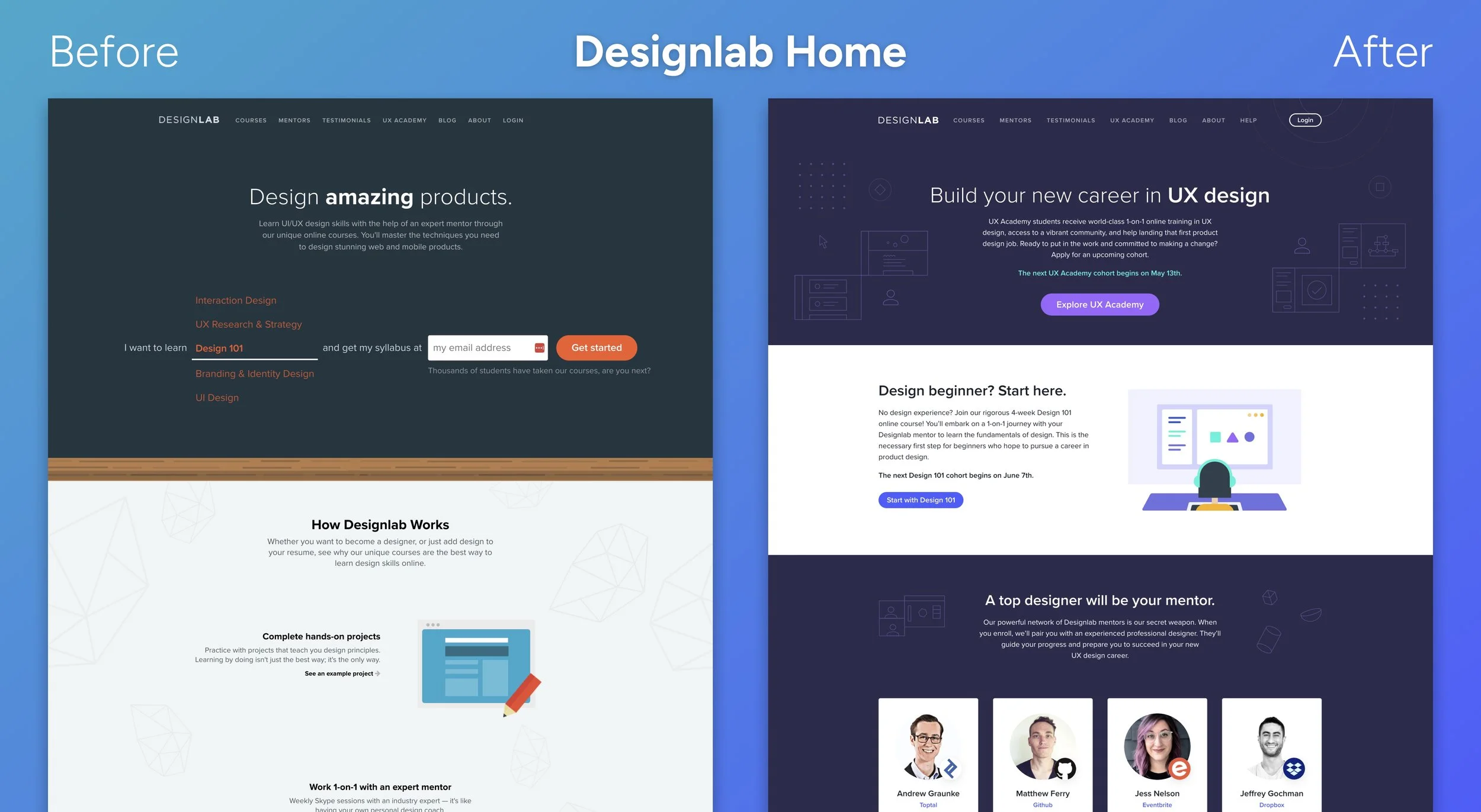
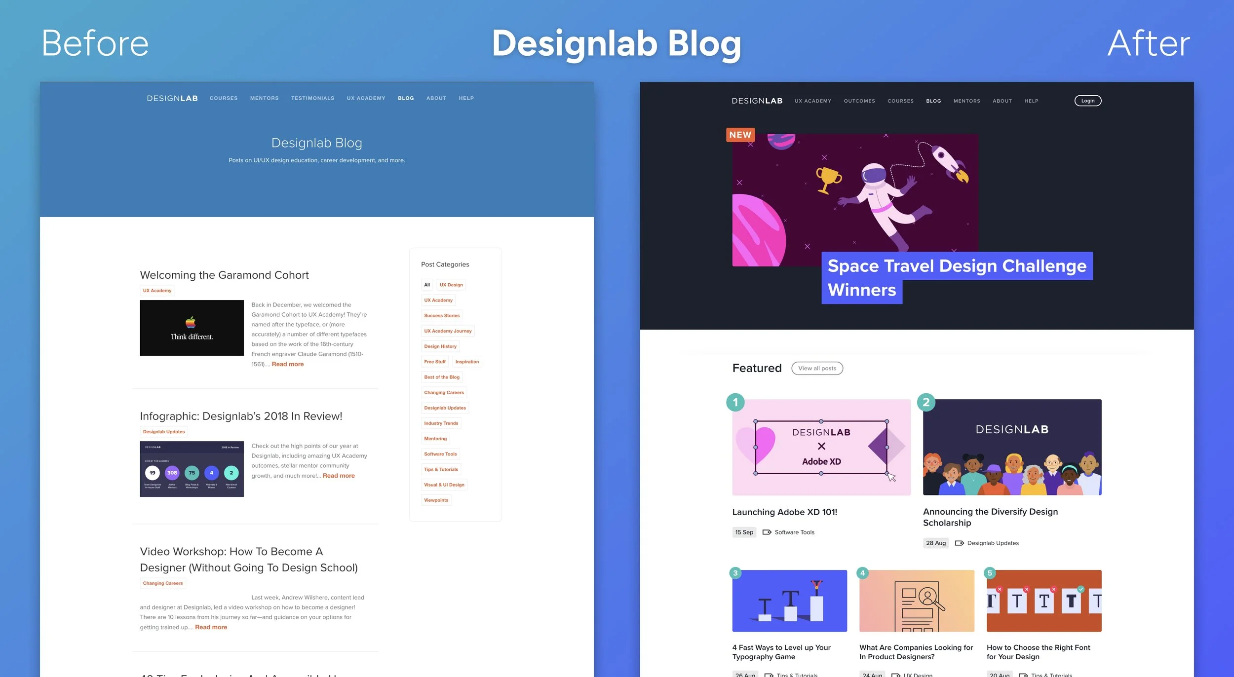
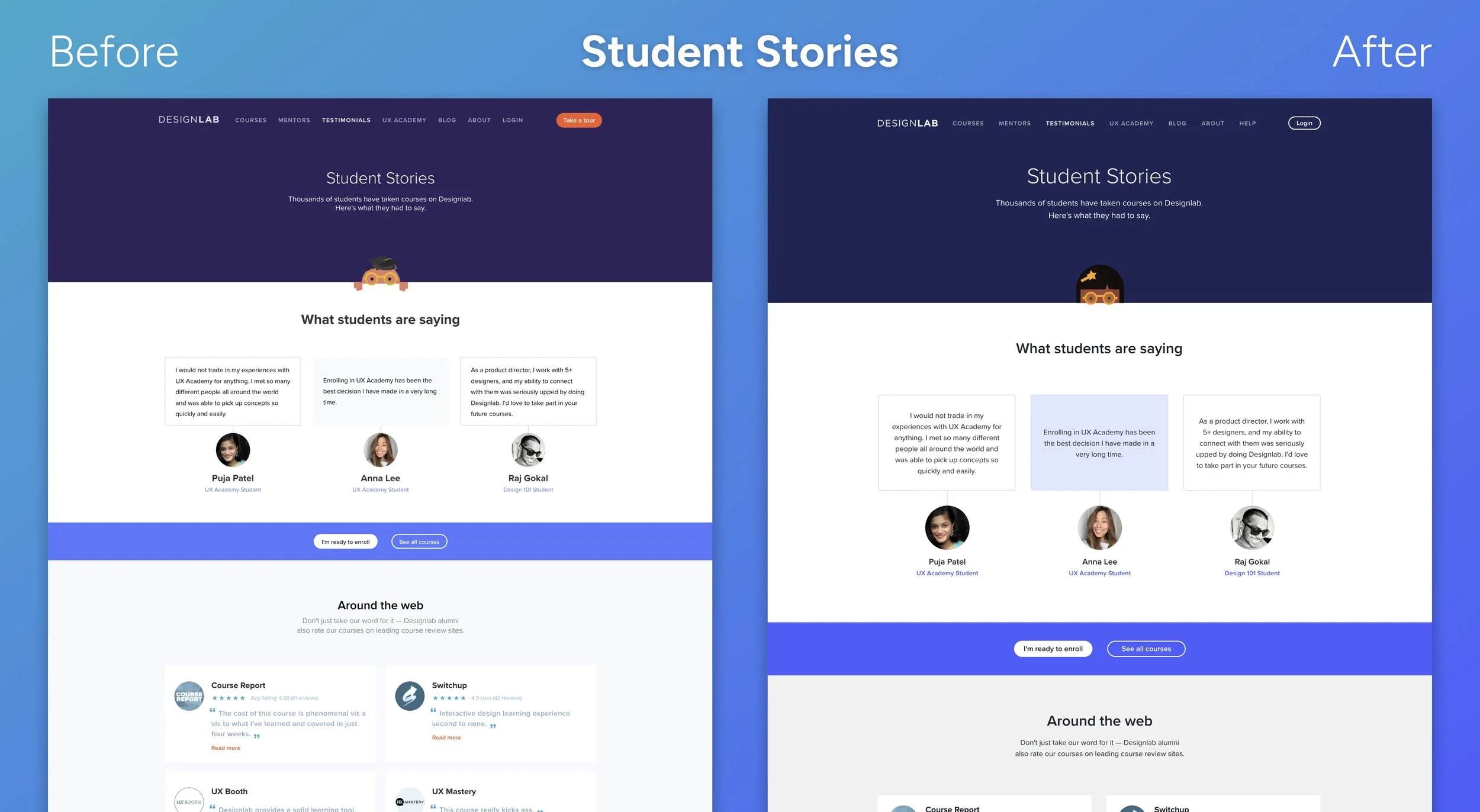
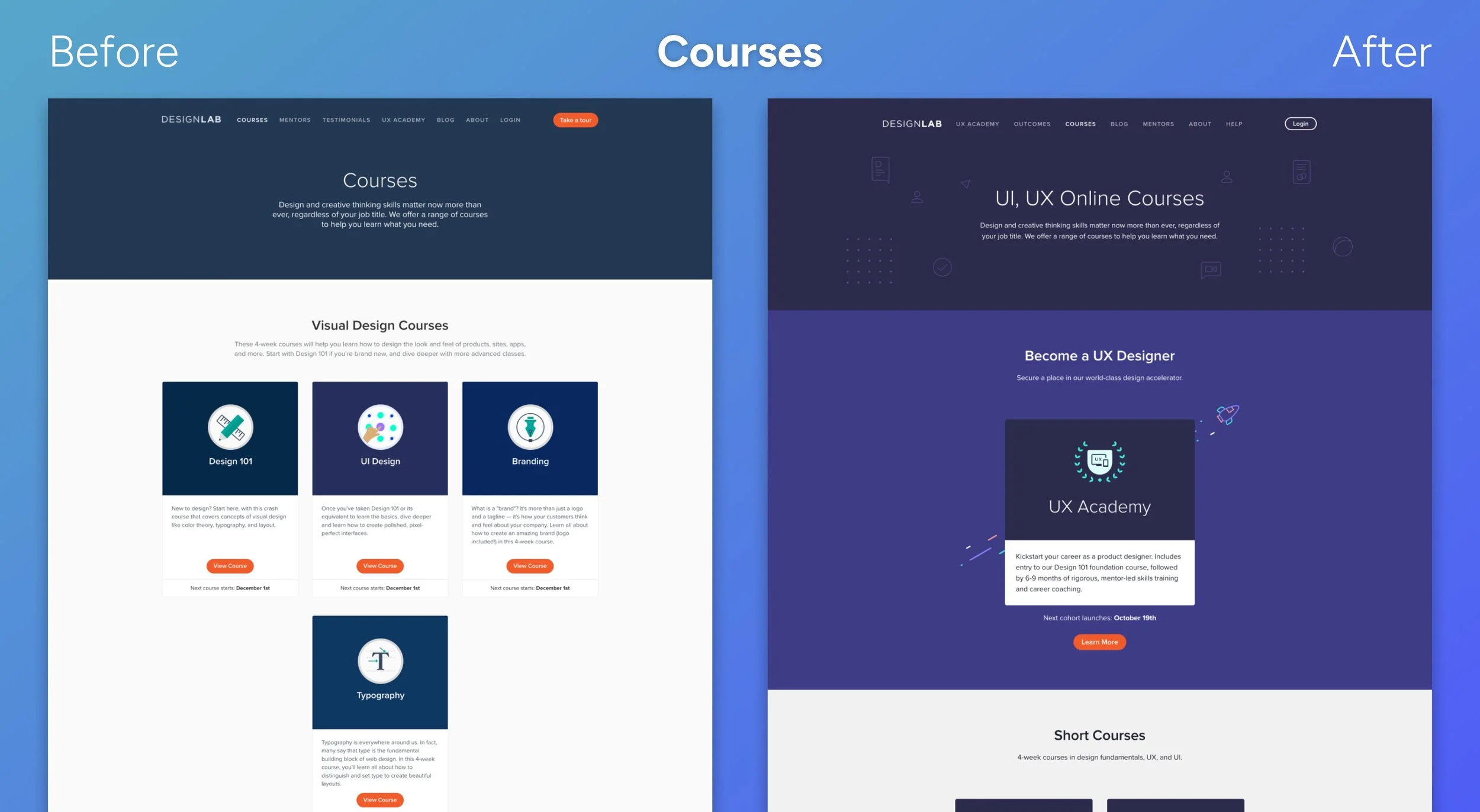
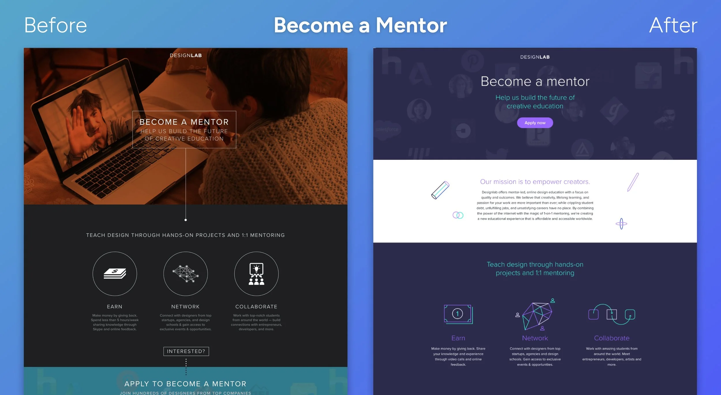
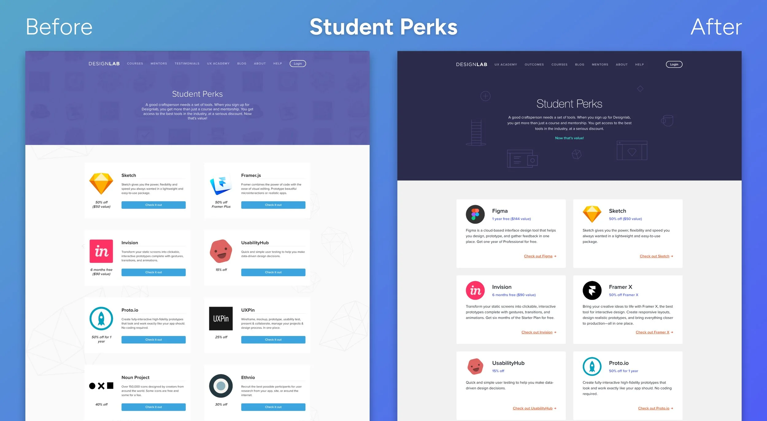
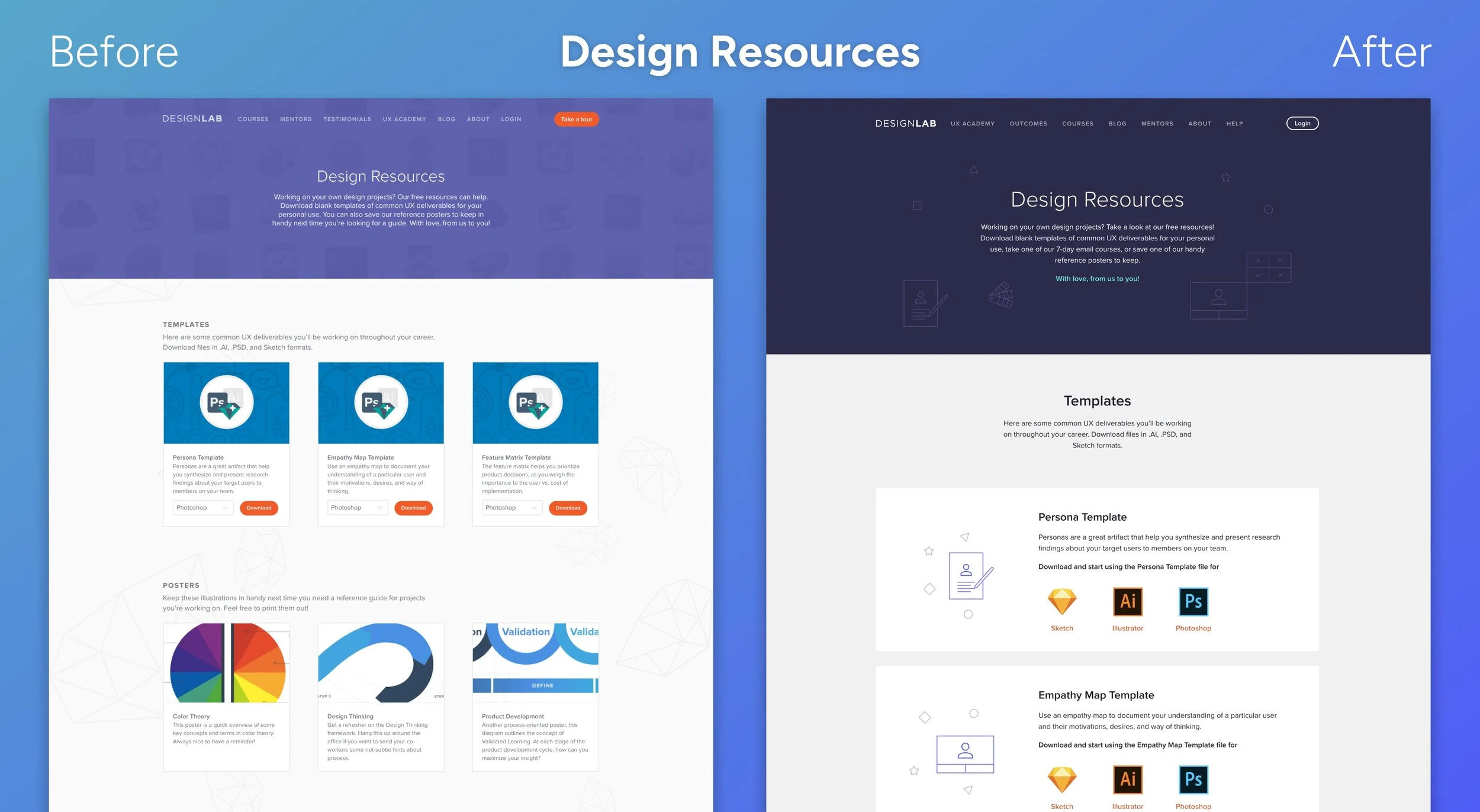
We used the system to overhaul our marketing site, bringing clarity and consistency to the visual language while improving navigation, hierarchy, and accessibility. With reusable components and clearly defined tokens, we were able to move quickly without sacrificing polish. The launch felt cohesive and intentional across all pages, from landing flows to calls to action, and laid the groundwork for a more unified brand experience.
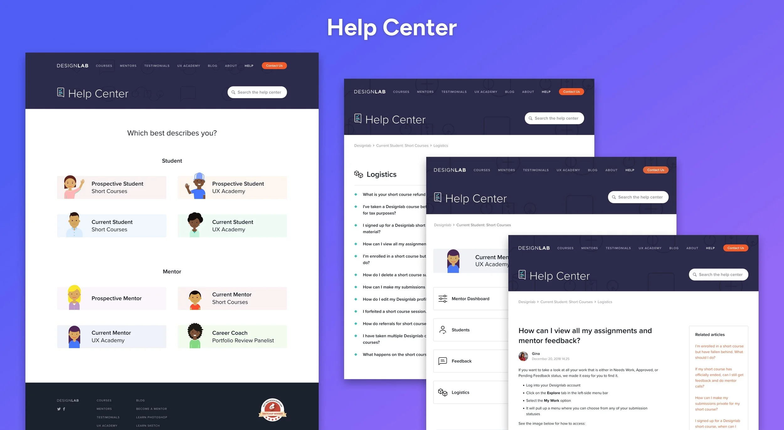
From there, we extended LUMA across the Student and Mentor Dashboards, our online curriculum, third party Help Center, Blog, and HTML emails. Each implementation had different needs, but the shared design language allowed us to scale without fragmenting the experience. I partnered closely with backend developers to implement flexible templates and streamline collaboration. As a result, the development timeline for new web pages dropped from 2 Weeks to just 2 Days. We could prototype, build, and launch faster while reducing UX debt and simplifying long-term maintenance across the ecosystem.